Jun 25, 2026
Advancing the Frontier of K-12 Diagram Generation
How we're collaborating with Anthropic to build an autonomous R&D loop to advance the frontier of math diagram generation for K-12.
Peter Edmonds · 18 min read
Coteach now generates K–12 math diagrams more accurately, faster, and at lower cost than frontier image models available through ChatGPT and Gemini on our K-12 diagram benchmark.
This progress comes from a collaboration with Anthropic, where we built an autonomous R&D loop for diagram generation: a benchmark grounded in real educator requests, an evaluator calibrated to human judgment, and agents capable of running experiments against Coteach’s generation pipeline.
In this post, we explain why diagrams are so difficult for language models, what finally worked, and what we learned about using agents to push on hard R&D problems.
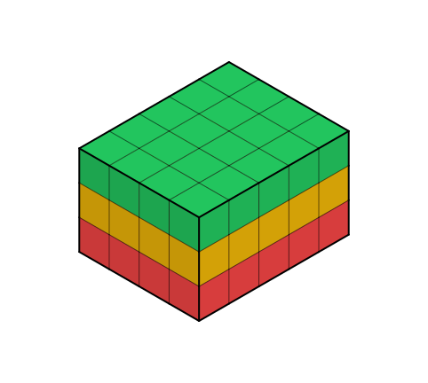
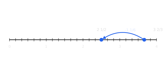
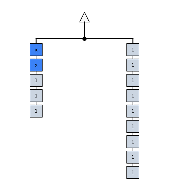
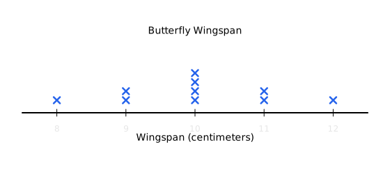
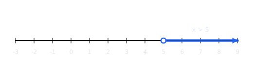
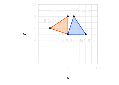
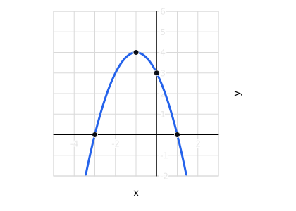
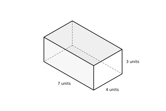
Volume with unit cubes
Why Diagram Generation is Hard
Diagrams in K-12 mathematics are ubiquitous. The number lines, area models, tape diagrams, and plethora of other representations students encounter throughout their education serve as a cornerstone of conceptual understanding, often as the centerpiece of instructional value.
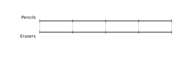
Despite their centrality, these representations have remained remarkably resistant to the technological transformations reshaping the rest of education. As AI systems have achieved fluency from data analysis to code generation, the humble mathematical diagram (a tape diagram partitioned into just the right sections, a composite prism partially filled with unit cubes, or a pedagogically sound hanger diagram) remains stubbornly, deceptively difficult to produce well.
Our mission at Coteach is to pursue hard problems like this in service of the students and educators across K-12, building AI systems with fidelity that lift up the entire ecosystem.
In the last year, Coteach has generated nearly one million diagrams for educators, spanning nearly every K–12 concept from number lines to complex geometry. This dataset has given us a rare view into both the diagrams educators actually need and the failure modes language models consistently exhibit when generating them. Across our data, three dimensions emerged as essential to diagram quality: mathematical accuracy, visual fidelity, and pedagogical appropriateness. A successful diagram must excel across all three, but even the most capable models struggle with each.
1. Mathematical Accuracy
Mathematical accuracy measures the extent to which a diagram correctly represents a mathematical concept, for example, that the angles in a triangle sum to 180 degrees, or that the hypotenuse of a triangle is defined by the Pythagorean theorem. Language models are not infallible mathematicians, and their inevitable mistakes propagate to the diagrams they generate. Some of these mistakes are obvious, but many can go unnoticed without a closer inspection.
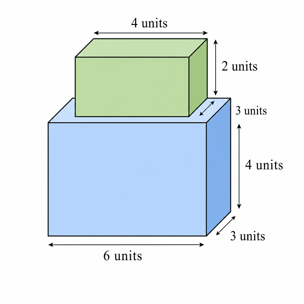
A stack of prisms generated by GPT Image 2. Two dimensions are labeled as “3 units”, but one is clearly shorter than the other.
2. Visual Fidelity
Visual fidelity measures whether a diagram is perceptually clear and usable. Labels must be well positioned, axes must use appropriate scales, important relationships must be visually apparent, and no element should distract from the mathematical idea being represented. Achieving this kind of fidelity is not merely a matter of aesthetics; it is central to whether the diagram can function as an instructional tool.
In practice, we have found visual fidelity to be the most persistent failure mode for language models.
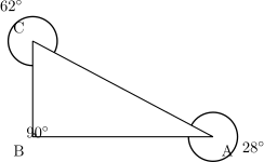
A mathematically accurate triangle, but instructionally unusable due to confusing overlapping text.
Even experienced educators rarely create polished diagrams in a single pass. The human approach to visual fidelity is iterative: diagrams are visually inspected throughout the creation process, with each pass informing subtle changes to label placement, tick spacing, typography, spacing, and emphasis. Educators can rely on their eyes and cultivated judgment to revise a diagram until it feels clear and intuitive. Today’s language models, by contrast, have no native visual feedback loop. Asking a model to produce a complex diagram in one shot requires it to predict the final visual result without seeing it, an ability we have not observed in practice.
3. Pedagogical Appropriateness
The final dimension of diagram quality assesses pedagogical appropriateness: is this the right representation for this learner, at this point in time? Diagrams exist within the context of a learner’s journey and the curriculum the teacher is following, meaning the same diagram can be right or wrong depending on when it is delivered. Consider the following diagrams.
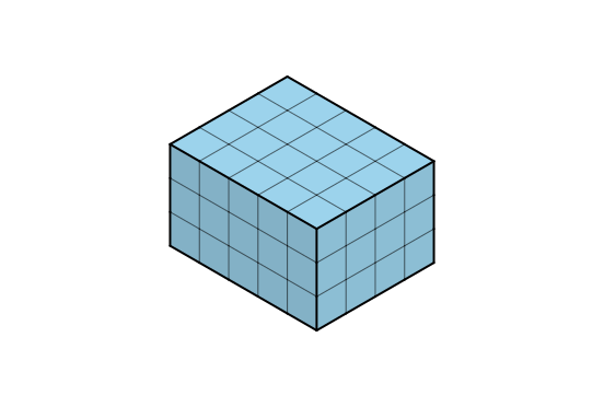
Filled with unit cubes
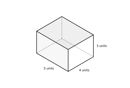
Dimensions labeled
Two correct diagrams of the same 3 × 4 × 5 prism. Which one is “better” depends entirely on where the student is in the lesson.
Both representations are mathematically accurate, and both exhibit visual fidelity. But deciding which diagram is “better” is impossible without understanding the pedagogical context in which it will be used.
In the first unit of Grade 5 in IM360, students work toward two related but distinct learning goals:
1. “Measure the volume of a rectangular prism by finding the number of unit cubes needed to fill it.”
2. “Measure the volume of a rectangular prism by using the V = length × width × height formula.”
Without knowing which goal the student is working toward, we risk delivering an otherwise good diagram at the wrong time. A dimensions-labeled prism may be perfect once students are ready to use the formula, but premature if the instructional goal is to help them see volume as the number of unit cubes that fill a solid. The core mathematical moment is the bridge between these ideas: that multiplying the side lengths is equivalent to counting the unit cubes.
Achieving pedagogical appropriateness requires more than the raw intelligence and multimodality of frontier models. It requires an agent with rigorous curriculum alignment, pedagogical judgment, and access to the context surrounding each educator’s unique situation. We built Coteach, our curriculum-aligned agent for K–12 educators, to fill this gap, and we are now extending it with diagram generation capabilities designed around these three dimensions of quality.
Automating Progress with Loops
We worked with Anthropic this Spring, combining our technical expertise in K-12 with their deep R&D experience to push diagram generation forward. Our goal was not to implement a one-off improvement, but to build a system capable of autonomously improving, driven by Claude.
As Claude models become more adept at tackling open-ended R&D problems, we worked to establish infrastructure which enables agents to autonomously benchmark performance, interpret results, and iteratively run experiments to drive continuous improvement, minimizing human intervention.
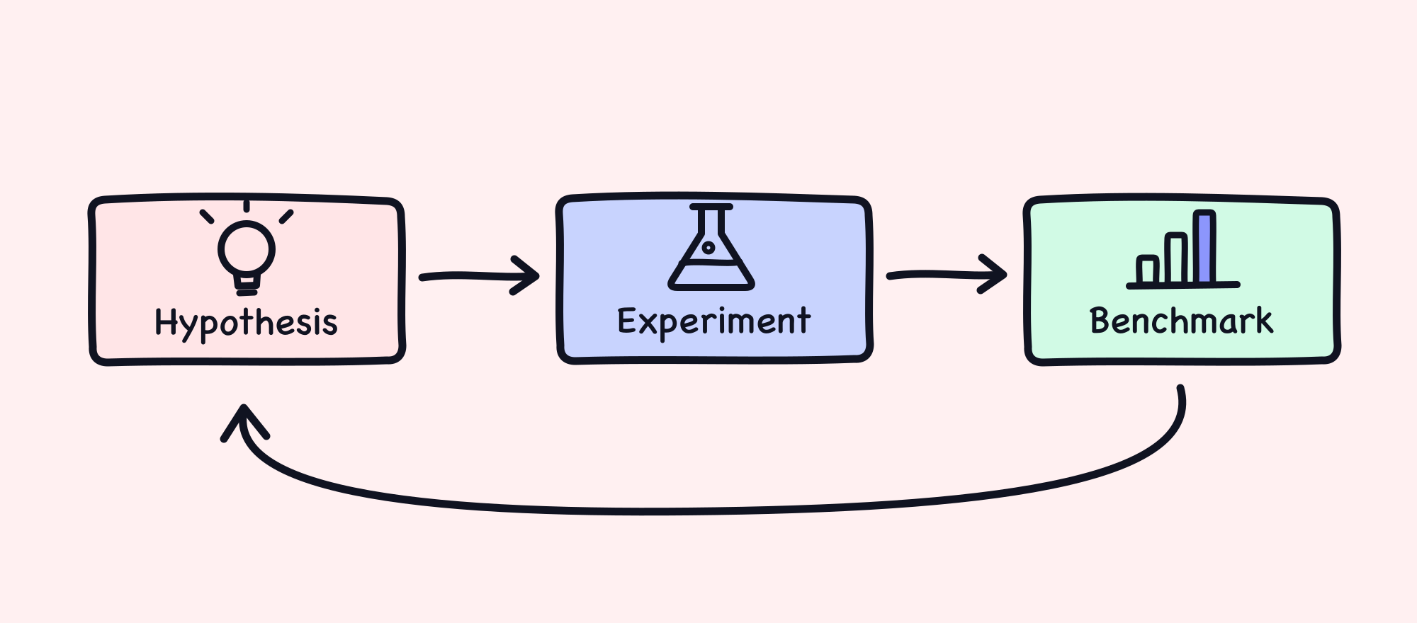
The autonomous R&D loop: an agent forms a hypothesis, implements it as an experiment, and benchmarks the result. Then it goes again.
Creating a Benchmark
Any effective research project requires reliable measurement, and diagram generation is no different. To enable an autonomous R&D cycle, we developed an internal benchmark which measures a language model’s ability to generate diagrams for a wide variety of instructional situations in K-12.
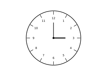
Based on our dataset containing nearly one million real-world requests for diagrams on Coteach, we generated hundreds of synthetic test cases, each an authentic situation in which a diagram was requested, for example: “An analog clock face showing the hour hand at 11 and the minute hand at 6, with no digital time displayed. Students read the analog clock to determine the half-hour time and write it in digital form.”
Human experts then annotated hundreds of existing diagrams from IM360 and Coteach-generated samples, documenting if the diagram was well-formed according to our dimensions of quality, and detailing any specific issue with it. We used this dataset of annotated diagrams to tune an LLM-as-a-judge, calibrated against those expert labels.
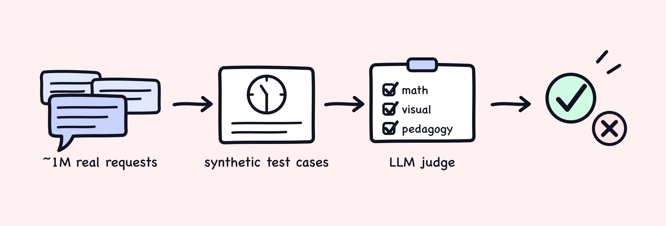
From a million real requests to a trustworthy score: authentic requests are distilled into synthetic test cases, and every generated diagram is graded on all three quality dimensions by a judge calibrated to expert judgment.
Across a set of 279 expert-annotated diagrams, our judge achieves strong agreement with expert annotators: Cohen’s κ = 0.83 after correcting for chance agreement. In plain terms, the LLM judge and experts reach the same verdict on 91.8% of diagrams.
Calibrating the judge taught us as much about measurement as about judging. Re-inspecting the same borderline diagram, a single judge changed its verdict roughly a third of the time: instability that masquerades as noise in every downstream benchmark score. Building a majority-vote variant (three independent inspections per diagram) cut those verdict flips to under a tenth, turning what looked like generation variance into error bars we could actually reason about.
This automated evaluation now serves as the feedback mechanism driving ongoing autonomous improvements: trustworthy enough to hill-climb against, cheap enough to run hundreds of times a day.
What Worked
With a trustworthy judge in place, Claude could run a whole R&D cycle autonomously, from forming a hypothesis to implementing an experiment and interpreting results.
Rather than pointing a single agent at the entire problem space, the team began by seeding a handful of initial research directions and dispatched a separate agent down each path. Each agent ran for hours, often implementing dozens, or even hundreds, of experiments.
After our agents explored various approaches, one stood above the rest on our benchmark: a custom agent harness built with two complementary layers: a framework layer and a knowledge layer.
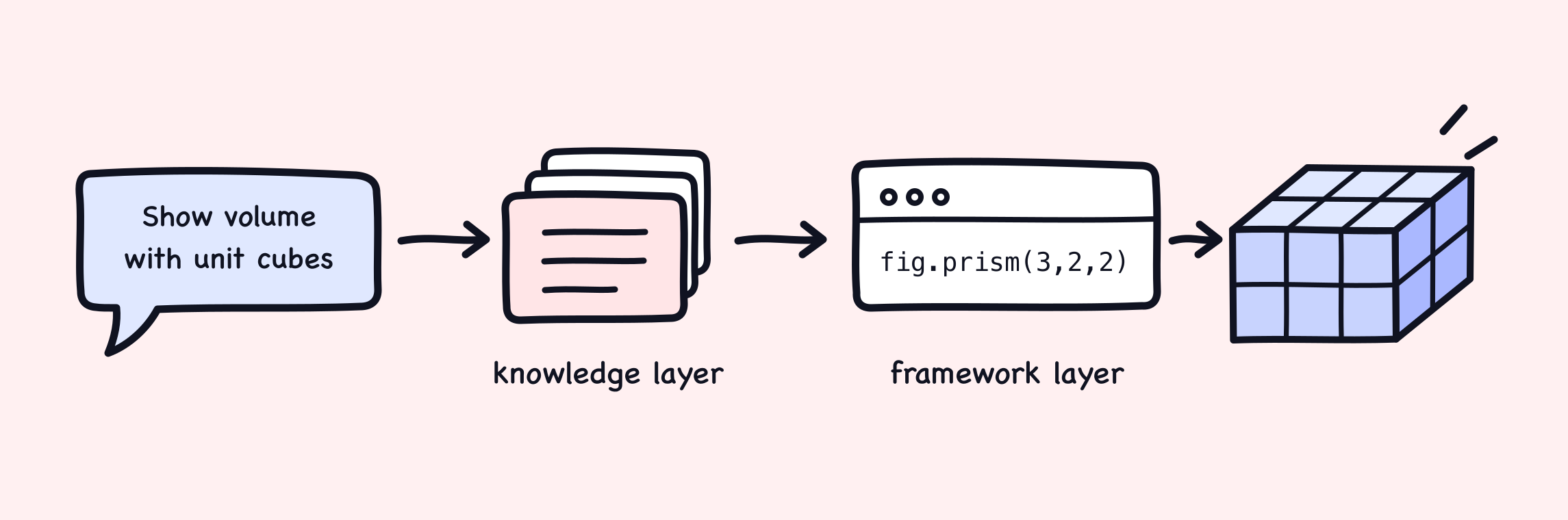
One request, end to end. The knowledge layer decides what to draw; the framework layer guarantees it’s drawn correctly.
The Framework Layer
The framework layer defines the format our agent uses to author diagrams. A good format has to understand its primary user: the language model itself. It should lean on what models do well (writing code, composing abstractions, adapting from examples) and compensate for what they do poorly: iteration is expensive, arithmetic is unreliable, and layout prediction rarely survives contact with a renderer.
We evaluated the obvious formats first, and each failed in its own way:
- TikZ, the academic standard used throughout Illustrative Mathematics' curriculum, proved too brittle. Minor mistakes in its esoteric syntax broke the entire pipeline, and models couldn't predict the compiled result, requiring many slow rounds of trial and error.
- Tool calling, predefined functions like
create_number_line(from, to), raised quality by constraining the model, but buckled as the tool count grew and offered no way to express the long tail of ad hoc diagrams educators actually request. - SVG was maximally flexible, and the preferred format for LLMs, but lacked any guardrails. With the model controlling every stroke and label, mathematical accuracy and visual fidelity had no safeguards at all.
The best option was one we had to invent: fig, our novel JavaScript library for K-12 diagram creation, designed for LLM authors.
Like tool calling, fig provides primitives for common mathematical figures: number lines, coordinate planes, isometric rendering, and more. But unlike predefined tools, fig lets the model compose these primitives in code, rather than simply choose a single representation. This solution strikes a balance between the unbounded capability of TikZ and SVG, while retaining much of the guardrails we could enforce with tool calling.
import { render } from '@coteach/fig';
import { isometric, prism, dimensions } from '@coteach/fig/solids';

const figure = isometric({}, () => {
  const block = prism({ width: 3, height: 2, depth: 2 });
  return [
    block,
    dimensions({
      solid: block,
      text: {
        width: (d) => `${d} units`,
        depth: (d) => `${d} units`,
        height: (d) => `${d} units`,
      },
    }),
  ];
});

const svg = render(figure);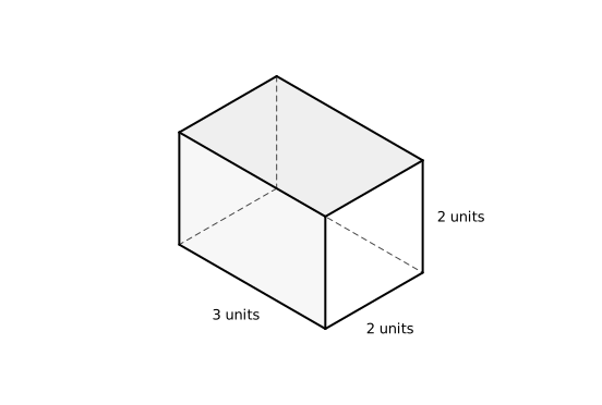
An agent uses primitives from fig to declare a prism; the framework itself ensures visual fidelity. Toggle to the diagram to see the exact output of this code; each dimension callback receives the true 3D length, so a label can never contradict the constructed solid.
This fixed two problems at once. Mathematical accuracy became enforceable, because diagrams are produced by evaluated code rather than generated tokens. Visual fidelity improved, because deterministic layout replaced pixel-by-pixel prediction.
The Knowledge Layer
A strong framework can improve mathematical accuracy and visual fidelity, but no amount of code can ensure pedagogical alignment on its own. To solve this, we built a knowledge layer: a collection of expert-informed documents, pedagogical cookbooks, best practices, and worked examples for handling diagram generation across different instructional situations.
This layer is where our team's network of experienced educators becomes something an agent can use. People who have taught these concepts and built lessons around these exact representations encoded their intuition into the collection, codifying instructional moves such as when a tape diagram should show the setup rather than the answer, or when a volume diagram should use unit cubes rather than labeled dimensions. Each document captures highly specialized judgment, too sparse for frontier models to gain from pretraining.
When a diagram request enters our pipeline, an agent dynamically searches this collection and reads the domain-specific guidance it needs, providing the model pedagogical context that the framework layer alone cannot provide.
Together, the framework layer and knowledge layer create a bespoke harness, teaching it what expert teachers would draw, and providing custom tools to allow it to draw well.
Results and Benchmarks
We evaluated Coteach against the frontier image models educators reach for today, GPT Image 2 (ChatGPT) and Gemini 3 Pro Image, on our benchmark of 250 diagram requests spanning K-12. Every pipeline was graded by the same calibrated judge on the same requests.
Coteach produces a classroom-ready diagram 88.8% of the time, nearly thirty points ahead of GPT Image 2 (60.0%) and Gemini 3 Pro Image (54.4%). While performance on our own benchmark is already best in class, we believe real-world performance to be higher. We designed the benchmark to be hard, weighting it toward tough cases in 3D geometry and graphing, while most classroom requests call for more common representations.
A system educators use every day has to be fast and affordable, too. We measured both end to end for every diagram in the benchmark.
Coteach delivers its median diagram in about 16 seconds at $0.10: roughly 9× faster and half the cost of GPT Image 2, while also being markedly more accurate than both image models.
Accessing Coteach Diagrams
Our improved diagram generation capabilities are now live for all Coteach users across every plan.
Diagrams API
Recognizing that other K-12 teams could benefit from our advancements, we're looking for early partners on an upcoming Coteach Diagrams API. Developers interested in integrating these capabilities can join our waitlist to stay informed and gain early access.
Learnings and Limitations
Today, agents run a large part of our R&D process. From benchmarking to implementation to experimentation, they have significantly accelerated our ability to conduct research. Yet the breakthroughs still came from human ingenuity. Our team discovered the problem, engineers ideated solutions worth exploring, and expert educators encoded their judgement. Even the most intelligent models failed to perform those tasks. However, once pointed in a sensible direction, they ran for hours and covered far more experimental ground than we could have by hand.
We’ve found that using agents for R&D is itself a skill, and one that requires deliberate practice. Practitioners must learn to identify “agent-shaped” problems, turn rich datasets into rigorous benchmarks, and monitor and steer agents when their trajectories drift. We’re grateful to Anthropic’s Beneficial Deployments team for sharing this craft with us, and for their technical contributions throughout. We’re proud of what we’ve built together, and excited to deepen the partnership as we build more R&D loops for other high-stakes problems and jointly advance the frontier of K-12 education.